Annual Report Re-Design
Design
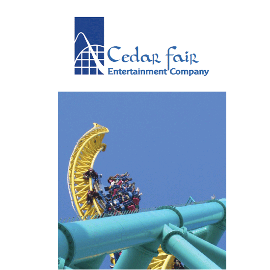
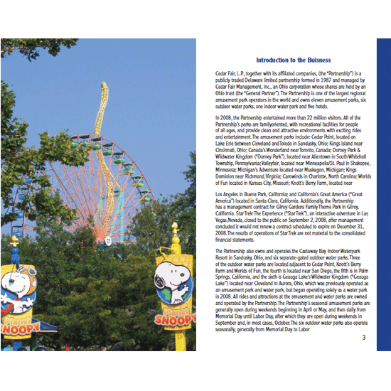
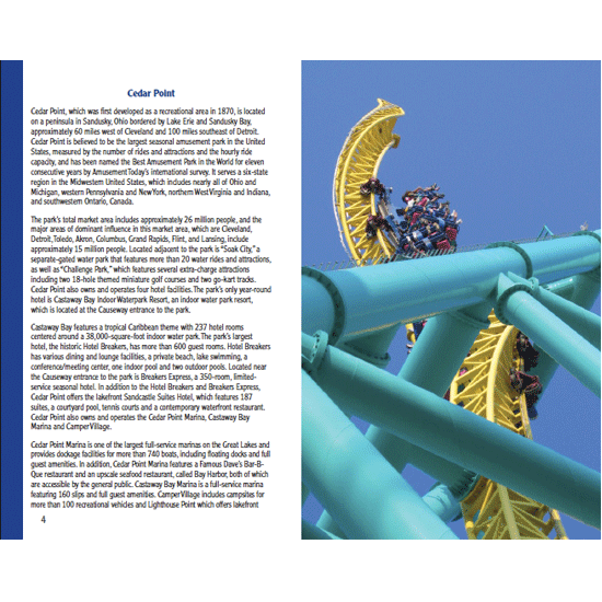
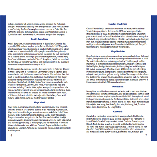
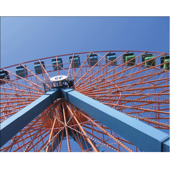
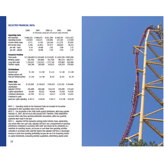
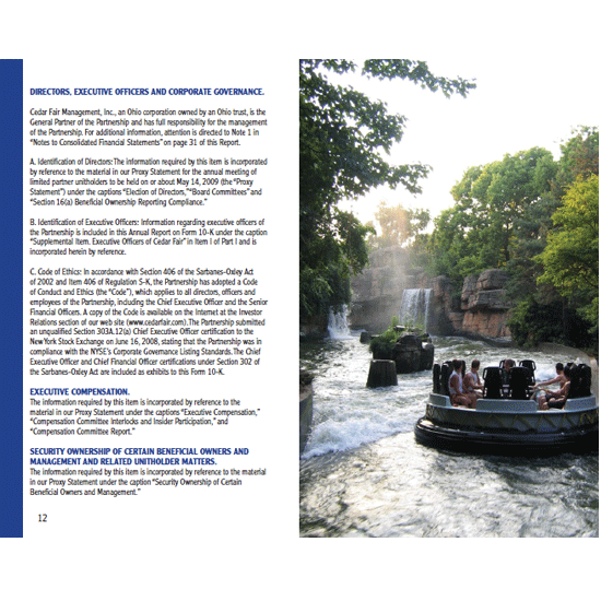
Tasked with finding a poorly designed annual report and then create a design that is up-to-date and demonstrates the company’s image. For being a company that is know for its amusement parks their annual report was rather bland and boring. I wanted to show how bright and up-beat their parks can be and used color and full page images to demonstrate.
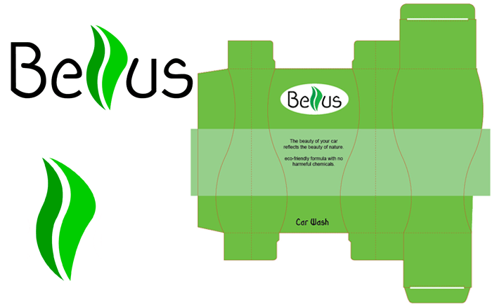
Bellus Car Care
Branding + Design
We were to come up with a new company and provide them with an identity package, as well as design and create a possible product package. Bellus is Greek for beautiful. Being a car enthusiast I wanted to design a "green" product. A line of car care products that are environmentally friendly.
Music Poster
Design
The music was dominantly Jazz, full of color and motion. So I did not want anything else to detract from that. Keeping the rest of the poster clean and light.
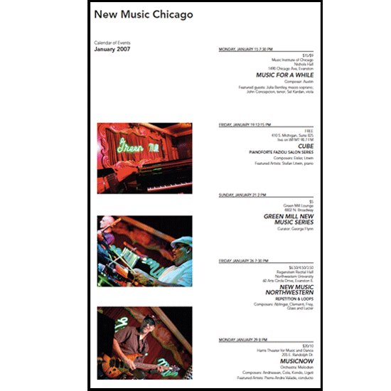
Visit Chicago
Branding + Design
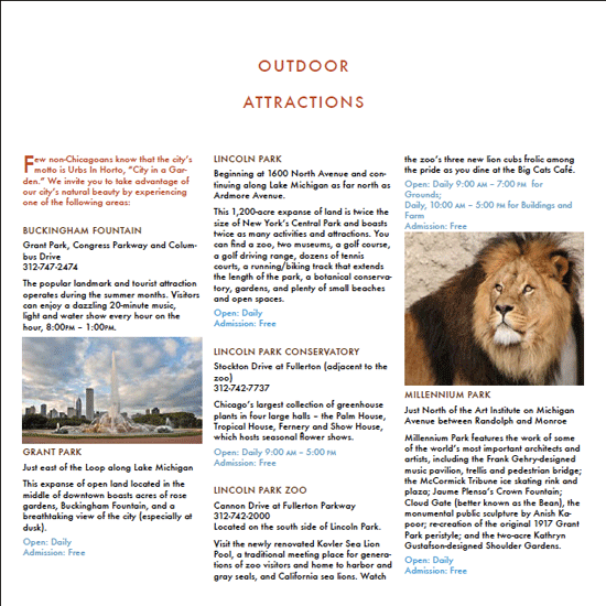
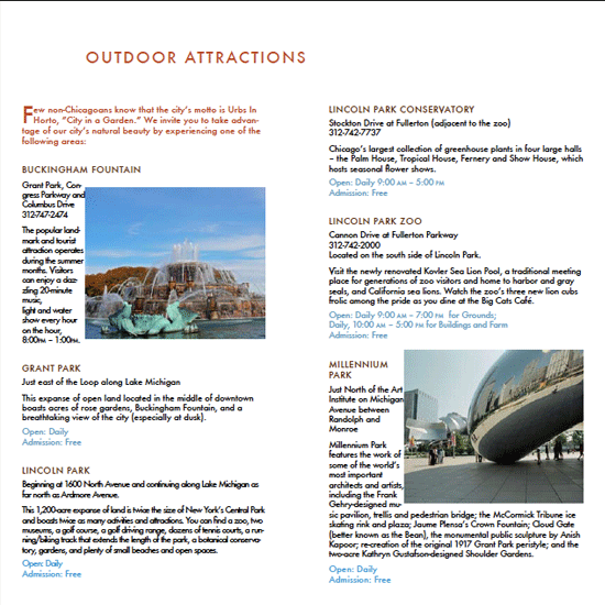
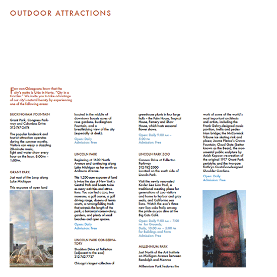
Was provided text and images and then worked with different methods of laying them out. Trying different column combinations while maintaining hierarchy and balance.
Wedding Stationary
Design
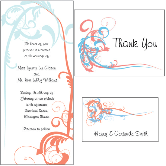
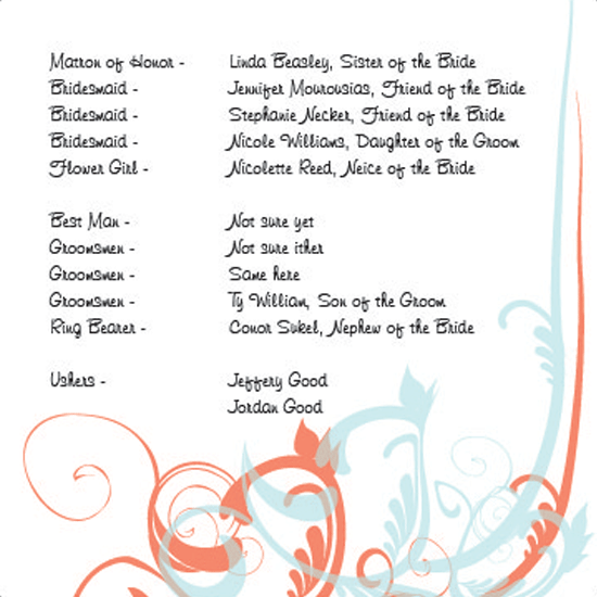
Was given the colors blue and red to work with. I was looking for something elegant, but not gaudy. Something clean and airy.
Midwest Equipment
Design
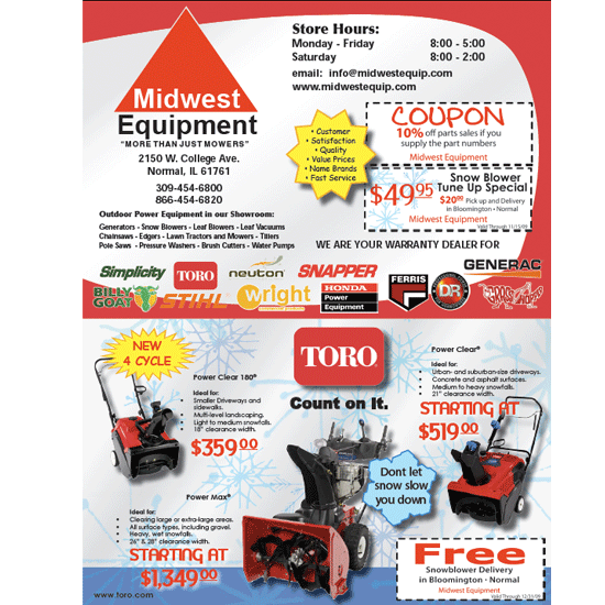
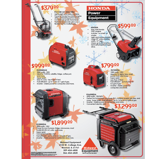
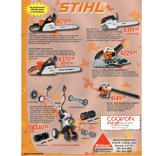
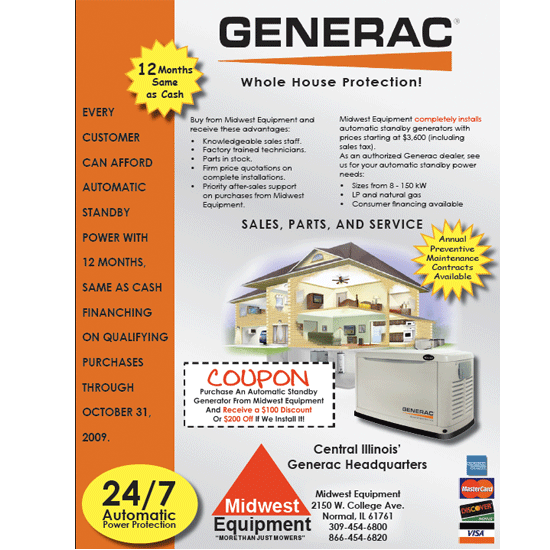
Contacted by the co-owner of Midwest Equipment to re-design their fall winter sales flier. Most competitive ads are bland and uncreative. I wanted something colorful and upbeat but without going overboard.
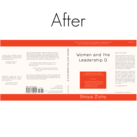
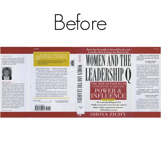
Book cover Re-Design
Illustration + Design
I had to find one of the worst designed book covers and then re-create it. The original cover was text heavy, hard to read, and used far to many different typefaces. I wanted to incorporate a typeface that looked clean and professional, yet had a little flair. I also cleaned up some of the unnecessary text boxes.
